Last update: 03/06/2023
In a nutshell
Your visual identity is how you translate your purpose into visible elements. It can be defined as the collection of all brand elements that you create to portray the right image of your brand. While the Values will help your employees taking the right decisions and having the right behaviors, the Visual Identity will ensure your customers/clients to recognize (without any doubt) who you are and why you exist.
In the Marketing Canvas
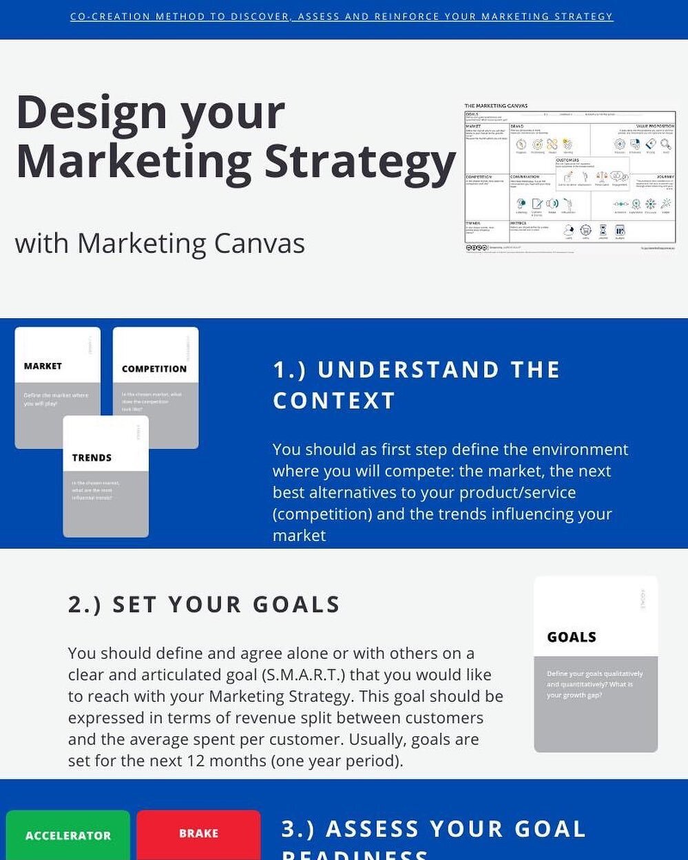
The Marketing Canvas is a powerful tool for entrepreneurs and non-marketers to build a robust marketing strategy. It consists of six meta-dimensions, each with four sub-dimensions, for a total of 24 sub-dimensions defining your Marketing Strategy. One of these sub-dimensions is VISUAL IDENTITY, which falls under the BRAND meta-dimension
Enhancing and Understanding Visual Identity
Visual Identity is more than just a logo or a specific color palette; it's an amalgamation of all tangible elements that help consumers distinguish one brand from another. More importantly, it serves as a visual representation of a brand's core values, mission, and personality.
Consider a company operating in the clean, green, and sustainable business sector. Its visual identity may embody elements of nature, using earthy colors, and organic shapes, alluding to its environmental stewardship.
Brand is your logo and visuals, too. A great brand deserves a great logo and great graphic design and visuals. It can make the difference when the customer is choosing between two great brands. But these alone cannot make your brand great. [2]
Tools for Visual Identity
Crafting a resonant visual identity requires a deep understanding of a brand's core philosophy and aspirations. Subsequently, these insights are transformed into a coherent visual language. The tools for achieving this comprise of:
Logo: A well-crafted logo should be instantly recognizable, conveying the brand's ethos in a visually appealing manner.
Color Palette: Colors elicit emotional responses and help create brand associations. A well-chosen color scheme can enhance a brand's message and connection with its target audience.
Typography: Fonts often subtly communicate a brand's personality. For instance, a modern, clean typeface may suggest a forward-thinking, innovative brand.
Imagery: Consistency in the style of imagery used, whether it’s the use of photographs, illustrations, or graphics, adds another layer of depth to the brand identity.
Brand Guidelines: To ensure consistent application across all mediums, a comprehensive brand guideline document is necessary. It serves as a rulebook, detailing everything from logo usage to color codes and fonts.
Visual Identity and its Relationship with other Marketing Canvas Sub-dimensions
The real power of visual identity becomes apparent when viewed in context with the other sub-dimensions of the Marketing Canvas. All dimensions are interconnected, and each can impact the other.
Purpose and Values: These drive the creation of the visual identity. A brand with a purpose centered around sustainability will have a visual identity that reflects this commitment, possibly with green color schemes or nature-inspired logos.
Positioning: Your positioning in the marketplace should be echoed in your visual identity. If you're positioning yourself as a luxury brand, your visual identity should exude sophistication and elegance.
Experience: Visual identity plays a significant role in shaping customer experience. It helps in setting the right expectations and evoking desired emotions from customers, thereby influencing their overall experience with the brand.
Pricing : Your product and its pricing strategy can influence your visual identity. If you sell premium products at a higher price point, your visual identity should align with this to convey a sense of exclusivity.
Translating Visual Identity into Action
Translating visual identity into action requires consistency and strategic integration across all brand touchpoints:
Brand Consistency: All visual elements, from the website to packaging, should represent the brand accurately, fostering trust and recognition.
Strategic Partnerships and Collaborations: By aligning with like-minded brands, events, or influencers, you can further reinforce your brand's visual identity and expand your reach.
Product and Service Design: The design of the products or services should also resonate with the visual identity. For a green business, this could translate to sustainable materials in their product design or eco-friendly packaging.
Brand Evolution: As brands grow, their visual identity should also evolve to stay relevant and appealing, while still maintaining a connection to the original brand ethos.
Evaluating and Improving Your Brand's Visual Identity
The visual identity of your brand plays a crucial role in shaping how consumers perceive and connect with your brand. It extends beyond just a logo – it includes color schemes, typography, imagery, packaging, and even the layout of your physical or online presence. It should be consistent and aligned with your brand values, resonating with your target audience while differentiating you from competitors.
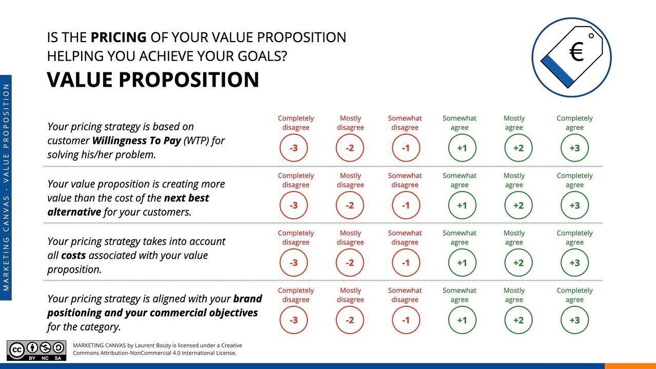
To evaluate the effectiveness of your visual identity, measure your agreement with the following statements on a scale from -3 (completely disagree) to +3 (completely agree):
Your brand's visual identity is distinct and instantly recognizable.
Your visual identity accurately reflects your brand's values and personality.
Your visual identity stands out against those of your competitors.
Your visual identity is consistently applied across all touchpoints.
If you find yourself disagreeing with these statements, it's time for a reassessment. This might involve refining your logo, re-evaluating your color palette, redesigning your website or packaging, or even embarking on a complete rebranding journey.
Example: Suncharge
To elucidate this further, let's consider a practical example in the context of a clean, green, or sustainable business. Suppose we have a start-up that aims to revolutionize the renewable energy sector by introducing portable, solar-powered chargers for electric vehicles, named "SunCharge". The purpose of the start-up is clear: to promote sustainable energy usage and reduce reliance on non-renewable sources.
The creation of the visual identity for SunCharge, like any brand, starts with understanding its core values, target audience, and unique selling proposition. The brand aims to convey innovation, environmental responsibility, and reliability. With this in mind, the creation of visual assets, such as logos, color palettes, and typography, should all be aligned with these principles.
Logo: The logo is the most crucial aspect of visual identity. A logo should be unique and must encapsulate the brand's essence. For SunCharge, the logo could be a sleek, modern design combining a stylized sun and a charging symbol, hinting at the renewable energy source and its application.
Color Palette: The choice of colors significantly affects how a brand is perceived. Greens and blues are typically associated with environmental friendliness and trust, making them a good choice for SunCharge. Additionally, warm yellows or oranges could symbolize the sun, bringing a positive and energetic vibe to the brand.
Typography: This should reflect the brand's character. For a modern, innovative brand like SunCharge, clean and straightforward sans-serif fonts might be the best choice.
Images and Graphics: These should consistently follow the chosen aesthetic. This might include images of clean energy sources, modern technology, and graphics with a simple, modern design.
Brand Guidelines: This document ensures consistency across all visual aspects of the brand. It should define the logo usage rules, primary and secondary color palettes, typeface choices, and more. This will serve as a reference for anyone creating materials for the brand, ensuring a unified and coherent brand image.
Conclusion
In conclusion, a strong visual identity does more than making your brand look good. It communicates your brand's values and personality, creates a memorable impression, and fosters a deeper connection with your stakeholders. It's a demanding process, but when done right, the result is a brand that is not only visually appealing but also communicates its essence at a glance.
Sources
Woven Agency, https://woven.agency/blog/what-is-the-brand-identity-prism/
Harvard Business Review, A logo is not a Brand, https://hbr.org/2011/06/a-logo-is-not-a-brand
HowBrandsAreBuilt, https://howbrandsarebuilt.com/blog/2018/12/21/the-brand-identity-prism-and-how-it-works/
Inkbotdesign, https://inkbotdesign.com/kapferers-brand-identity-prism/